The world wastes more than twice as much energy as it uses every year
Sometimes looking at the big picture is the best way to understand what’s going on.
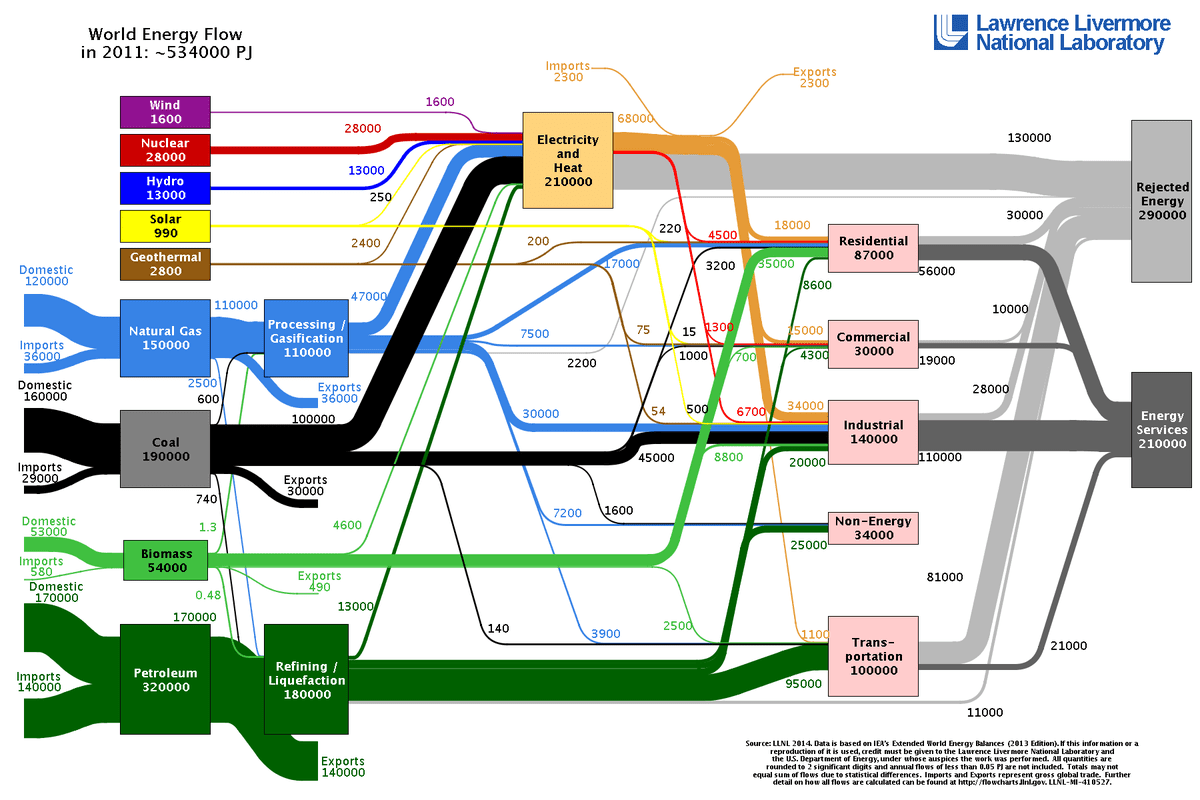
That’s definitely the case for figuring out where the world’s energy comes from and goes. Lawrence Livermore National Laboratory makes these energy flow maps showing where energy comes from and how this energy is used for each country and the world as a whole.
This information can be really useful when we are trying to pin down ways to slow climate change. Since you can see where the biggest bubbles are in the pipeline, you can see where we need to cut down. And, looking at how skinny the renewable energy sources’ lines are, where we need to bulk up.
In 2011, the world used 534,000 petajoules (PJ) of energy, and the biggest source of that energy was oil, unsurprisingly, at 60%. For context, the average American home used 39 billion Joules of electricity in 2013; a petajoule is equal to 1,000 trillion joules.
Here’s how the world’s energy flow breaks down: